You have created a beautiful website with an eye-catching design, but your conversation rates are still low. Most people think that if a website looks nice, then that should lead to success. Unfortunately, website design has more to do with how a website actually works, than necessarily with how it looks. Increasing your conversion rates requires a balance between usability and engaging design.
You should ensure that your website design is reflective of your goals and that it functions well. You want your website to be relevant and efficient. Poor design features can actually hurt your conversions.
Here are ten website design features that you need to avoid.
Outdated Website Design
One of the essential requirements for keeping your conversion rates healthy is a modern and updated website. If you designed your website five years ago or more, then it is time to consider an upgrade. New technologies are constantly being developed, which means that website designers are able to quickly and efficiently update websites and give them a much-needed refresh.
Attracting visitors to your site is just the first step. You need to keep them on the page and wanting to return again another time. Old-fashioned website designs will harm your conversion rates. Visitors are likely to click away quickly if your site seems tired and old, assuming that the rest of your technology and products are equally outdated.
Using Stock Images
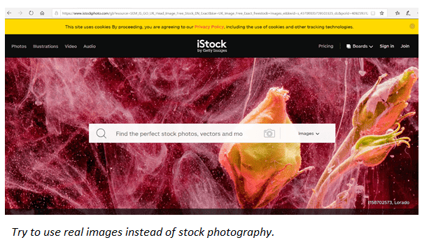
You’ve probably heard that using images, or at least visuals, on your website is a necessary component and that it will attract more visitors to your site. This is true. On the whole, visual content tends to increase engagement. However, the type of images you use make a huge difference.
The beauty of stock images is that there are some fantastic ones available to use straight away. The downside is that using them can actually damage your credibility and therefore impact negatively on your conversion rates and your business as a whole. In experiments, it has been found that real images outperform stock one. This is because people tend to find stock images fake and inauthentic.
It is important to carefully consider what images you are using on your website and why. The human brain only takes 13 milliseconds to process the information from an image. This can be the difference between keeping or losing a potential customer.
The images that you use on your site need to be specific. They should be relevant and purposeful. They also need to be high-quality. This is especially important if you are selling services or products via your website. It sends a more positive signal to your potential customers if you use real photos of the products you are selling. This allows customers to see what can be expected if they buy the product from you and will help to create trust and confidence in your brand.
Unclear CTAs
Your website should have a goal. This may be getting visitors to subscribe to your mailing list, request a quote or make a booking, or to make a purchase via your website. The goal of a call-to-action (CTA) button is to encourage the visitor to take an action, such as the ones listed above. It is vital that your call-to-action buttons be clear and easy to identify. Their mere presence on a page can affect the behavior of visitors, so you need to think carefully about how, when and why you are using them.
The most important aspect of a CTA button is clarity. If your call-to-actions are confusing, this can harm your conversions. The CTAs should specific and the message they contain should correctly align with the experience that visitors can expect to receive once they click them. Make sure that you guide visitors properly through your website. If you want them to click on something specific, such as a particular page, make that journey simple and clear for them.
Another important factor to consider is the design of the buttons themselves. Too many buttons with no discernible difference can be confusing and can cause visitors to simply abandon your site. Instead, consider creating one specific button that will take them to alternative pages or options. The buttons should be attractive and be in-keeping with your overall page and website design. You need to ensure that they are visible and eye-catching, so as to encourage visitors to click on them. Keep the message short and simple. This will help make your website more usable and lead to higher conversions.
Unnecessary Carousel Sliders and Features
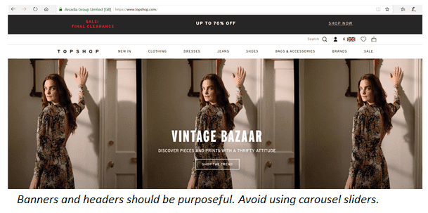
The reasoning behind carousel sliders is that they offer the opportunity for you to showcase some of your best products or services and they look nice on the page. The reality, however, is that they don’t actually improve your conversion rate. In reality, very few people click on or engage with them. This means that you have potentially invested time and money into an aspect of your website that does nothing to improve your conversions.
Another downside of carousels is that they extend the time it takes for your website to load. They also cause problems when loading on mobile devices (phones and tablets alike). Visitors can be impatient and this additional loading time can be sufficient to make them leave your site.
There are many features that you might want to include on your site because they simply look cool and make it appear more impressive. The downside to this is that features, such as rotating banners and other effects, only make your website seem heavy. In fact, they can distract and confuse visitors, which will cause low conversion rates.
You need to make sure that all the design elements that you include on your website are there for a reason. The features that you use should support the goals of your website and make it more user-friendly, easy to navigate and engaging to interact with. This is what will help to drive your conversions.
Illegible And Confusing Content
Despite the emphasis on visuals, the quality of the content, text or copy plays a huge part in actually persuading people to follow through with a purchase. One of the biggest problems is with the layout or presentation of the text itself. Big blocks of text are difficult to read and are unlikely to engage visitors. Similarly, using appropriate fonts which are legible and well-sized can make a huge difference. Aim to use a legible font/style and use a font size of 16 or more. If you are including important information, make it bold.
Another mistake to avoid is writing overly complicated content. Be aware of who your audience is. Write content which they can easily engage with. This means that you want to avoid using overly-technical terms or very long sentences. Aim to write coherent, well-structured copy using shorter sentences.
Related: A Complete Guide to Creating Website Content That Wins Customers
Lack Of A Search Box
Search boxes can be the difference between gaining or losing a customer. In much the same way that people use search engines to find specific information, the search box on your website allows them to look for specific content or products.
Being able to quickly and efficiently search for a product or content saves a lot of time. There are plenty of visitors to your site who are busy and impatient. They may not want to have to spend time navigating through various categories or pages to find the specific thing they are looking for. Having a search box, however, lets them find it quickly and without fuss.
This is particularly important function if you own an online store. If you have a large inventory or sell multiple types of products, it can take a long time for visitors to find what they are looking for. A search box allows them to find the product they want swiftly and they are therefore more likely to make a purchase. Make sure that your search box is user-friendly across all types of devices. Also check that search queries produce accurate results.
Broken Or Flawed Links
Clear, functioning links are a necessary feature of any website. If you have a broken link or button, this will not only make the journey more time-consuming and frustrating for your visitors, but it can be the hurdle that makes them turn to one of your competitors instead. Test the links on your website and make sure that they are fully functioning.
Any broken links or buttons should be addressed at once. This includes links to incorrect pages or pages which have since been removed. Pay particular attention to your main pages. Also test out your CTAs and ensure that they are working well.
Unclear And Complicated Navigation
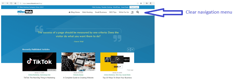
Once a visitor has arrived on your page, you want them to be able to find what they are looking for without hurdles. This is particularly true if you are selling products or services. Anyone visiting your website should be able to navigate around it easily. In order to achieve this, you need to make sure that your menu navigation is simple to use.
Your menu should have clearly labeled categories. The categories should be relevant to your business and reflective of where they will lead. You can then use sub-categories to distill the search further. You need to plan the type of journey you expect your visitors to take once they arrive on your site. Plan this carefully and get rid of any elements which might hinder or confuse your visitors.
If your menus are too complicated, users are likely to quickly leave your site. Moreover, chances are they will not come back. Make sure that visitors have a smooth journey through your website. By executing the correct navigation tactics, you will be able to gently lead users towards any actions you may want them to take, such as subscribing to your site. Make sure that all CTA buttons are easy to find and access.
Unresponsive Website Design
If you want to attract potential customers and increase your conversions, you need to make sure that your website is responsive. People are increasingly using a range of mobile devices, rather than computers, to access websites.
Not only does your website need to be responsive, but you also need to check how it actually looks on each type of device. Check whether images are appearing in the way you would expect and make sure that CTA buttons are displayed correctly on all devices. You should also check whether additional features (such as headers and banners) are displaying properly or need to be removed or edited.
Loading Time Is Too Slow
Page load time is crucial. A slow loading page will result in visitors abandoning your site. Most people expect a website to load within 2 to 3 seconds. This basically means that a delay of even one second could cost you a potential customer and reduce your conversion rates.
There are multiple reasons for slow page loads, including using images which are too large, using banners and carousel sliders, having too many plugins and having an unnecessary amount of Flash.
In order to speed up your page load time, try to use smaller image sizes. This means optimizing your images or compressing image file sizes. You can also try to reduce HTTP requests and make use of server-side caching. Double check for any broken links to reduce the amount of 301 redirects.
Related: Website Speed Optimization – What You Need to Know About It?
Summary
In order to increase your conversion rates, you need to have a website that works well and looks good. This means making sure that the design is modern and that the site is fast and responsive across all devices. Use real images to capture visitors’ attention and make sure that your CTAs are eye-catching and clear. Ensure that your navigation menus are user-friendly and that all links work. Remove any effects or features which are superfluous and slow down your site. If you don’t already have a search box, add one now.
Which website design features will you change to improve your conversions?