 Jackson Lane
The time when text-centric websites were the preferred choice to connect with the target audience is no longer relevant. In the dynamic digital world, the success of a website depends on visually appealing designs and lasting interactions through compelling stories. No matter if you’ve launched a blogging platform, e-commerce portal, or portfolio site, the image presentation can attract visitors or drive them away.
Here is the point where CSS styling images can make things special and revolutionary for your website. Using CSS styles for images, it’s now possible to create stunning designs that speak for your brand. Let’s gain a deeper insight into modern CSS styling. Discover various innovative and action-driven methods for captivating design elements.
Table Of Content
Why CSS Image Styling is Important?
Before directly getting into the logical flow of CSS for image styling, it’s important to understand its significance. The role of images as a creative resource is gaining momentum as businesses use them to complement their branding efforts. Here are some key reasons that make CSS image styling a must-have approach in your branding efforts.
– Visuals that Captivate
Using consistent forms of images throughout your website can give a professional appearance. Proper sizing, colors, and animations create a cohesive style that captivates visitors and encourages them to stay longer on your website.
– Seamless Engagement
Nowadays, users expect a flawless mobile experience during their browsing activity. Responsively styled images make the user journey easier, even in the limited space of the mobile device. When visuals on a website load quickly and align with the flow of your data, a user is likely to stay on it longer.
– Design for Smooth Experiences
The accurate use of CSS on images is a vital parameter when you aim to boost the optimization process. To offer an excellent user experience, it can style website images in a way that dynamically adjusts with different screen sizes.
– Unique Brand Perception
It’s well-proven that websites that have a consistent image pattern across all their pages create a special impression among visitors. Whether you follow rectangle-shaped images or specialized filters, the smart use of CSS fosters a unified tone of communication with your target audience.
Explore the Best Practices for CSS Image Styling
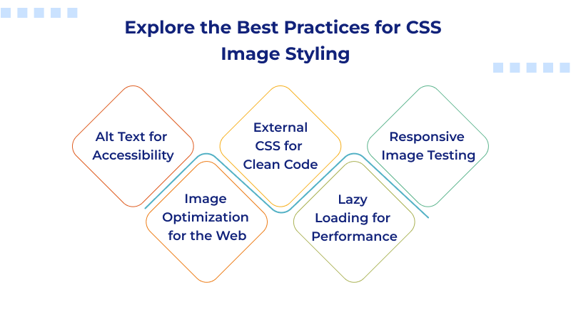
– Alt Text for Accessibility
It’s an ideal practice to use descriptive alt text for all images on your website. It ensures easy accessibility to the images across platforms.
– Image Optimization for the Web
Start optimizing your images for web portals that ensure better visibility. You can also use compressed images to reduce the storage burden on your website.
– External CSS for Clean Code
Maintain high clarity with external CSS files to simplify updates to code. It supports a scalable architecture, preventing your structure from becoming complex.
– Lazy Loading for Performance
Lazy loading methods on media-driven websites help to maintain steady performance and improve user experience. This approach is highly beneficial for long-scrolling sites such as e-commerce portals.
– Responsive Image Testing
Confirm image responsiveness to ensure they adapt to different devices and resolutions. In modern web design, this helps maintain layout consistency.
Related: Best Image File Types
Basic Setup: Adding Images in HTML
Start proper embedding of images within your HTML code before you start with CSS styling images. An <img> tag can fulfill your purpose. This tag needs certain attributes for accurate rendering.
<img src=”hosting.jpg” alt=”Description related to the image”>
Here, “src” stands for the destination of the source file or denotes the URL of the image.
“Alt” is significant from an SEO point of view as it gives an alternative text description for readers.
To ensure a highly responsive web design, you should avoid changing image size in HTML. Instead of this, you can use CSS to design stunning layouts according to your requirements that fit on different devices.
Making Images Responsive with CSS
When building a website using a modern web design, it’s a challenging task to ensure that all images used appear great across all devices. Using images with a fixed size can disturb the overall layout of the design.
CSS solution to resolve this issue:
CSS

img {

  max-width: 100%;

  height: auto;

}
This code instructs your browser to lower the image parameters if required, but never stretch the ratio beyond its natural standard.
To get comprehensive control authority, you can use media queries that can adjust the image size on the device screen in use.
CSS

@media screen and (max-width: 600px) {

  img {

    width: 80%;

  }

}
Related: CSS Style Sheet Types: Inline, External, and Internal
Maintaining Aspect Ratio Using object-fit
For several projects, you need to display an image inside a box, such as product cards or a gallery. While doing so, you don’t want any distortion. To achieve this, CSS’s object-fit property manages this characteristic.
Example:
CSS

img {

 width: 300px;

 height: 200px;

 object-fit: cover;

}
You can make effective use of object-fit when you require consistent sizing without compromising on the image quality.
Creative Image Shapes and Effects
When you use CSS on images, it creates immense possibilities for image styling that are usually not possible with traditional methods.
– Rounded Corners
Add soft curves with border-radius:
CSS

img {

 border-radius: 10px;

}
– Circular Images
These image types are ideal for profile pictures.
CSS

img {

 width: 150px;

 height: 150px;

 border-radius: 50%;

}
– Clip-Path for Custom Shapes
You can use the clip-path property to get different shapes, such as polygons or organic shapes.
CSS

img {

 clip-path: polygon(50% 2%, 2% 48%, 48% 48%);

}
When you use innovative shapes on your platform, it helps to create a lasting impression on users.
Image Positioning and Centering
Centering images horizontally is easy:
CSS

img {

 display: block;

 margin: 0 auto;

}
When you’re dealing with complex image layouts, the use of Grid and Flexbox ensures proper alignment.
CSS

.container {

 display: flex;

 justify-content: center;

 align-items: center;

}
When you place images at the center of flexible layouts, it helps to create a more user-friendly interface.
Transparency and Overlays
The addition of transparent layers to images can improve readability and give a more polished feel.
Use opacity:
CSS

img {

 opacity: 0.6;

}
Or add hover overlays for interactivity:
html
<div class="image-container">

 <img src="product.jpg" alt="Product">

 <div class="overlay">View Details</div>

</div>
CSS
.image-container {

 position: relative;

}

.overlay {

 position: absolute;

 bottom: 0;

 width: 100%;

 background: rgba(0,0,0,0.6);

 color: white;

 opacity: 0;

 transition: opacity 0.3s ease;

 text-align: center;

}

.image-container:hover .overlay {

 opacity: 1;

}
Effective use of the above approaches can help boost user engagement and long-term collaboration.
Filters and Transformations
If you need image layouts that follow a specific mood or maintain a unified look, CSS filters can make your task easier.
CSS
img {

 filter: grayscale(50%) brightness(120%);

}
Common filters:
- grayscale()
- brightness()
- contrast()
- blur()
- sepia()
Convert images to get dynamic visuals:
- Flip horizontally: transform: scaleX(-1);
- Rotate: transform: rotate(45deg);
With the use of the above creative methods, you can unify different types of images or change their appearance without affecting the source files.
Text Over Images
If you want to place readable text on images, you can wrap the image and text within a relative container. After that, position the text “absolutely.”
html
<div class="hero">

 <img src="banner.jpg" alt="Banner">

 <h1 class="hero-text">Welcome to MilesWeb</h1>

</div>
CSS
.hero {

 position: relative;

}

.hero-text {

 position: absolute;

 top: 50%;

 left: 50%;

 transform: translate(-50%, -50%);

 color: white;

 font-size: 2rem;

 font-weight: bold;

 text-shadow: 2px 2px 4px rgba(0,0,0,0.7);

}
To ensure easy readability of text, you can use shadows or overlays to boost the contrast level.
Conclusion
In today’s dynamic digital world, visually appealing designs play a crucial role in creating meaningful engagement with the audience. If you succeed in gaining expertise in the CSS styles for images, it can empower you to create stunning web designs.
Start learning the art of CSS image styling to build innovative and captivating web design projects. Apply different CSS techniques to website images and spread your brand story through visual elements.
MilesWeb, a leading hosting provider, delivers world-class hosting solutions that take the responsiveness of your images to the next level and ensure your website operates at its best.
FAQ’s
What role does image styling play in web design?
Using CSS for image styling makes a difference in the visual appeal of a layout and enhances the user journey on a website. With the implementation of CSS styling for images, design images that are highly responsive and act as the symbol for your brand’s identity.
What CSS techniques do I need to adopt to achieve image responsiveness?
CSS is a popular option for enhancing image responsiveness on a higher level. Set max-width to 100% and height to auto for designing well-adaptive layouts that adjust to different screen sizes. It allows your website images to scale according to their container structures.
Which CSS properties are commonly used for image styling?
Popular CSS properties include “border-radius” for creating rounded corners, “object-fit” for controlling aspect ratio, “filter” for integrating stunning visual effects, and “transform” for creating rotations and flips.
Which CSS settings do I need to use to create circular images?
Set the image border-radius to 50% and maintain the same height-width ratio to create circular images. These CSS styles for images provide perfect profile photos and avatars.