Buckle up, typography enthusiasts; 2026 will be a rocking year with the best typography trends of 2026 that can build your design career. While 2023 was all about finding new typography trends, it was also about letting some design trends go. When it comes to fonts, designs, color combinations, and many more design aspects, we make sure you always remain ahead of the competition.
Whether it’s an artistic blend of retro influences, cutting-edge tech, or pure creative ideas, we have collected the top 10 trends that will embrace your typography designs to new heights.
In this blog, we will discover 2026’s hottest font trends and mark the design world at its finest! So, what are you waiting for? Get along to find the best-trending typefaces and make your designs shine.
Table of Content
1) Minimalist Typography
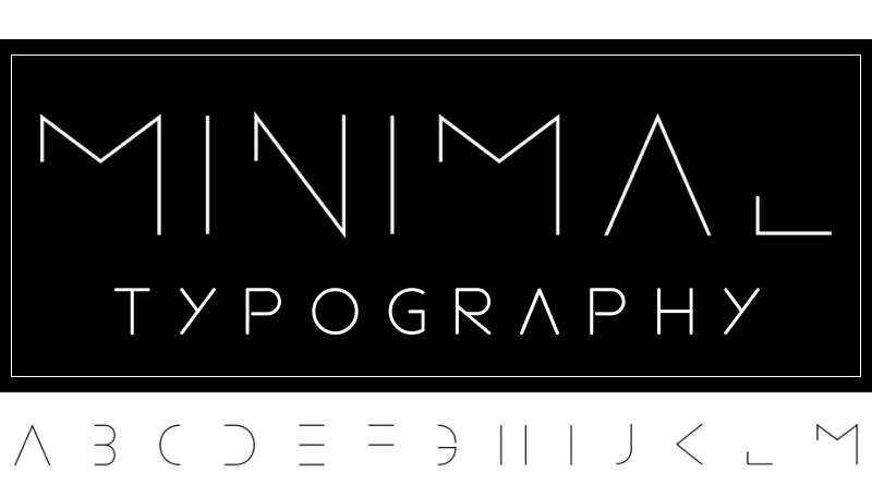
Well, the old saying continues:”Less is definitely more!” 2026 is about using elegance and grace with web typography trends. A majority of the designs categorized as cluttered and less aesthetic had excessive boldness, color combinations, or other text design elements.
The minimalist typography trend defines careful placement of each text element, opting for well-defined fonts, and playing effectively with spacing and kerning. However, minimal designs don’t have to be boring; we all know simplicity is the real beauty, isn’t it? To create a statement design, font trends can be scaled and contrasted using size, weight, and alignment.
2) Animated Fonts
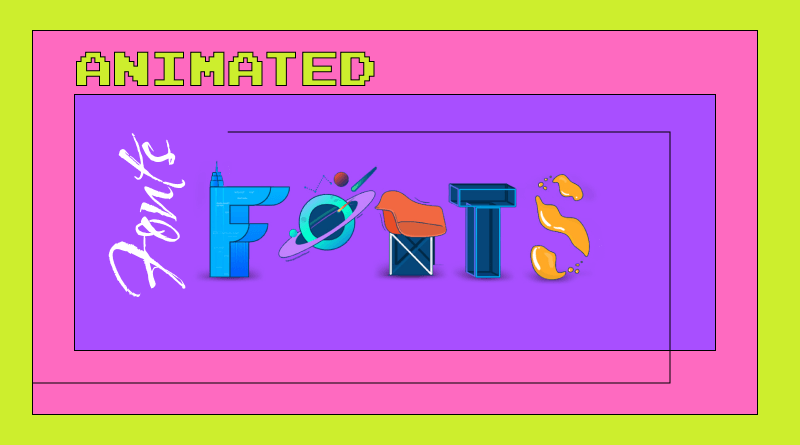
Animated fonts are powerful tools and the dynamic heroes of the font-designing world. While animated font styles are an old trend, they are never out of the blue. 2026 is about adding new, crisp, and fresh styles to the animative typography trends. Animated fonts are just like using movement in the fonts and bringing words to life.
2026 will most likely shift its attention to the dynamic, animated new typography trends on social media platforms. Whether an Instagram story or X’s tweet, animation will become a handy social typography pattern.
3) The Fine Art of Outlines
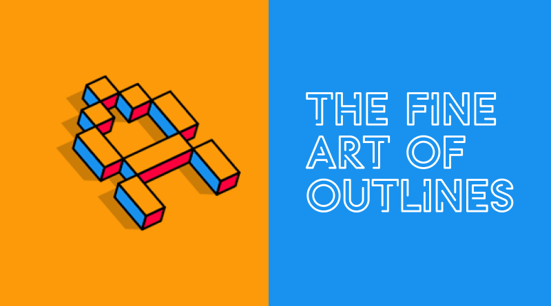
Outlines are one of the latest typography trends that combine impactful attention with intriguing effects. For instance, a massive, outlined headline becomes the focal point of the viewer instantly. Outlines offer the ability to layer and blend with other design elements.
Due to their seamless flow, outlines are known as the versatile typography trend. You’ll find outlines in the fonts used on digital screens to print materials, from clothing prints to architectural signage.
Using outlines effectively requires careful consideration of context and legibility. The only factor to consider is the perfect balance between the chosen font and outline weight. They should be suitable for the medium and size to maintain clarity and visual impact.
4) Gradient Paints with Fonts
When it comes to adding movement and depth to static letter, gradients will be the first call. In 2026, the design world will see some of the best gradient typeface designs.
Gradations create subtle transitions between colors when combined with text. The best feature of gradients is that they expertly create the illusion of three-dimensionality, making text appear to pop off the screen or page. The designers can also experiment with different lighting directions and shadow effects through gradation.
Gradient paints, when combined with font styles, prove to be typography design trends, guiding the viewer’s eye and highlighting key elements within a design. Gradation is also considered one of the easiest ways to emphasize headlines, calls to action, or specific words within a block of text. As per the current trends in typography, gradient paints help to add textures, depth, and various metallic effects to typography.
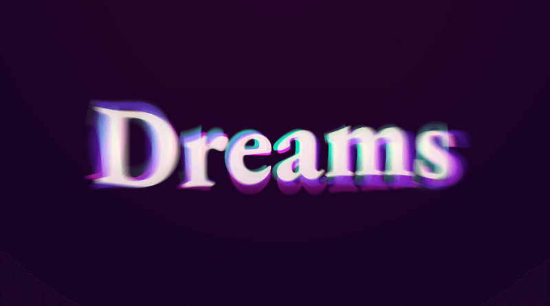
5) 3D Sculpting Words
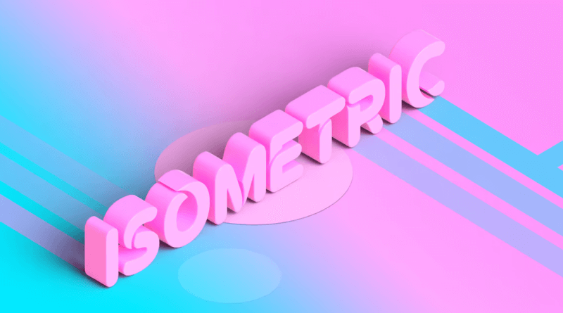
When thinking about 3D, I’m sure you must be getting visions about the realm of sci-fi movies and retro graphics. However, the stretch of 3D has now extended to the typography trends of 2026, where it is constantly adding depth, dimension, and visual impact to text projects.
Three-dimensional typefaces have the best advantage of eliminating flatscreen limitations, resulting in more life and mobility for texts. There is the versatile option of typography, allowing the designers to play with textures, intricate lighting effects, outlines, glow, etc. For websites using 3D typefaces, turbo servers are required to increase page loading speeds. Hence, such types of websites require the best web hosting provider.
6) Neon-Fluorized Brilliance
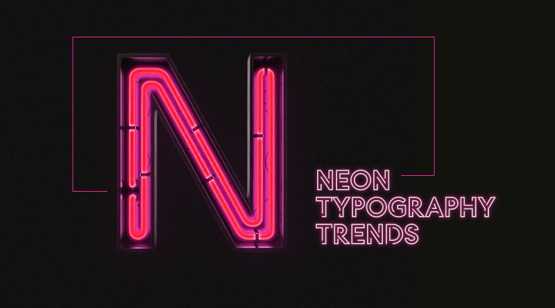
With the latest typography trends upcoming, neon colors have had a blast. Neon colors have revolutionized the typography world by instantly grabbing attention, making headlines, logos, and calls to action stand out against any background. For typography, designers pair neon colors with clean lines, minimalist layouts, and modern fonts for a fresh, impactful look.
With neon color brilliance, versatility becomes simple, and designers can play with creating urban vibes, futuristic typography environments, and much more. However, the point to note is that neon colors are a bit tricky to handle and can be difficult to read against certain backgrounds.
Hence, it’s advisable to use high-contrast and complementary colors carefully. Additionally, before finalizing the typefaces with neon colors, designers should test your design on various screens and backgrounds.
7) Charm of Serifs
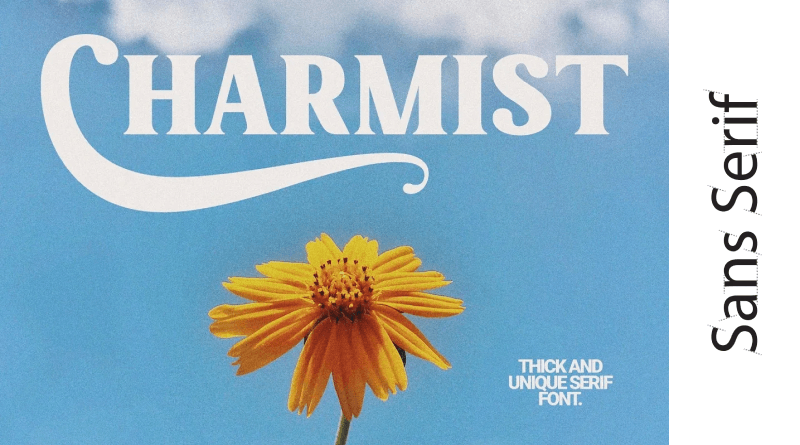
Serif font has been one of the most loved font styles of all time. The initial years of font trends have been ruled by sans-seifs. Now again, with the need for minimalistic designs, refinement fonts, variations, and bold weights, modern serif fonts have gained popularity.
The subtle curves and lines of sans-serifs are used constantly for longer body text. This eventually improves the reading experience on both screens and printed materials.
Because serifs are used for simple and minimal typography designs, designers must be careful when combining them. In order to effectively communicate a message and design, the typeface should be chosen carefully. However, a designer who can play carefreely with bold sans-serif can create striking combinations effortlessly.
8) Customized Typography
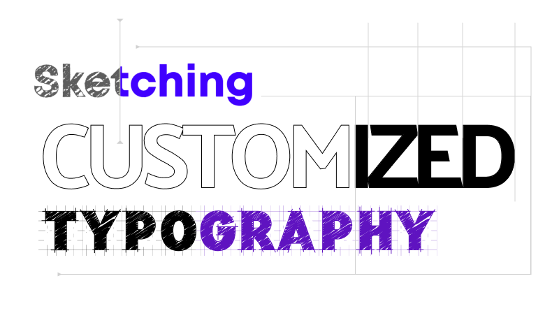
Web typography trends always revolve around customized typography. Websites that offer personalized user experiences attract a lot of attention from web users. In such a phase, having customized typography breaches users’ attention and promotes retention rates.
Customized typography design trends are a combination of handwritten fonts, brush-letting styles, user input, morphing shapes, doodles, or other similar patterns. This trend is perfect for digital experiences, websites, and social media posts. Because it adds a layer of engagement with the audience.
Customized typography can be easily seen in branding, packaging, and personal project presentations. As they build an authentic connection with users, people prefer them whenever real connections are needed.
Moreover, customized fonts can also be used for presenting infographics, annual reports, and data-driven presentations. The key point to remember is that customization doesn’t have to be chaotic; stay rooted in the alignment of the font and its weight and adjust it accordingly without disturbing the other elements of the designs.
9) Fonts and Colors: Dynamic Duo
When talking about the current trends in typography, how can we forget the dynamic duo of fonts and color? Both elements are like the magic brush in an artist’s life. Whether you are suggesting single-color schemes or fonts painted in complementary colors, the combination of text and color is wonderful.
The latest typography trends are all about effective ways of using color and fonts. Designers can test complex gradations and neon colors, or else they can roll on the pixel fonts and create animated versions with solid colors. The options are unlimited as per the designer’s imagination. Balance both color and font and you’ll eventually find the best typography design of 2026.
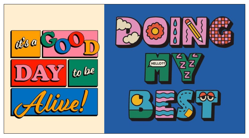
10) Images Curving Into Typography
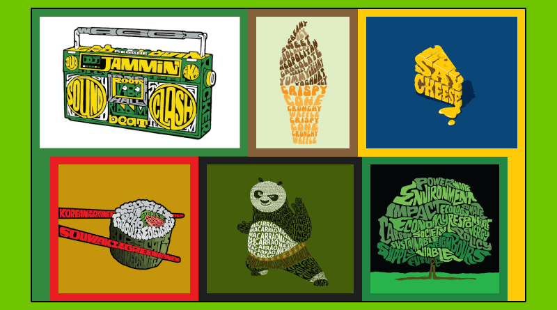
Do you remember using the alphabet “T” creatively to represent a tree in drawing classes? Yes, you can accept that, as your typography trends, images, and typography designs have been related to each other since the birth of the font trends.
It is nothing more than texts flowing around objects, morphing letters into shapes. With these trends, designers can easily showcase visuals with or without elements. In this trend, texts can be animated and contrasted with styles and textures.
Moreover, texts with images can be used to create illustrations with bold contemporary typography. They can also represent pixelated graphics with clean, modern letterforms.
Key Takeaways
There were some interesting new typography trends to learn about in 2026. With the changing design format and industry grades, it becomes difficult to keep up with the changing patterns. In this blog, we have included the best typography trends that will boost the performance of designers.
From minimalistic typography to the fine art of outlines, from neon brilliance to the magic of customized fonts, the world of typography is open to a lot of creativity and imagination.
Remember, these trends are built for the futuristic designs that will be boasted in 2026; consider them your stepping stones and build your design career. Animate, gradient, solid color, or serif fonts; let your creativity flourish and build the best typography references.
Typography: Frequently Asked Questions
Where is the typography used?
To give a simplified answer, the trend towards typography is everywhere. One can see the visuals of typography in countless aspects. To name some, typography is used in print media (books, magazines, and brochures), digital platforms (websites, apps, social media posts, games, menus), fashion, clothing slogans, decorative elements, and much more.
Why is typography important in UI?
The User Interface (UI) plays a vital role in the digital aspect. Web typography trends form the basics of UI typography. The right font choices, sizes, and layout ensure legibility and clear communication for the user. Typography also ensures that the website content is shaping usability, accessibility, and the overall user experience.
How do I use typography in web design?
There is no one answer for the ideal typography to be used in web designs. However, consider our general 5 steps that can be helpful for every general web design.
1. Choose 2-3 font styles that combine perfectly and stick to those dividing them for headlines, sub-headlines, and main body content. (Be open to contrast and combinations.)
2. Fix the use of font size, weight, and style to create a clear hierarchy of information.
3. Choose a primary alignment: Left-align most text for easy reading, but consider center or right alignment for specific elements like headlines or quotes.
4. Use color to create contrast, highlight important elements, and align colors with your brand palette.
5. Ensure your typography scales appropriately across different screen sizes and devices for optimal readability on all devices.
What are the important aspects of web typography?
Trending typeface accuracy is needed when it comes to websites. For web typography, the important aspects to be noted are as follows:
1. Readability: Font style, size, line height, letter spacing, text, background contrast.
2. Organization: Use of different sizes, font weights, text alignment, centered headlines, and white spaces for clutter-free presentations.
3. Responsiveness: The chosen typography should be scalable and adjustable across different screen sizes and devices.
4. Accessibilities: There are web-safe fonts supported by all browsers. Also, make sure your chosen font styles are accessible for users with visual impairments.
How do you choose the right typeface for your website?
Choosing the right web-trending typeface for your website is not an easy task; it requires a lot of consideration. Make sure clarity is prioritized in the typeface. Fonts should reflect brand identity; they should be web-compatible; and users should find them visually pleasing. To avoid confusion and struggles, limit your font options, use different font weights, and play safe with contrast and combinations.