
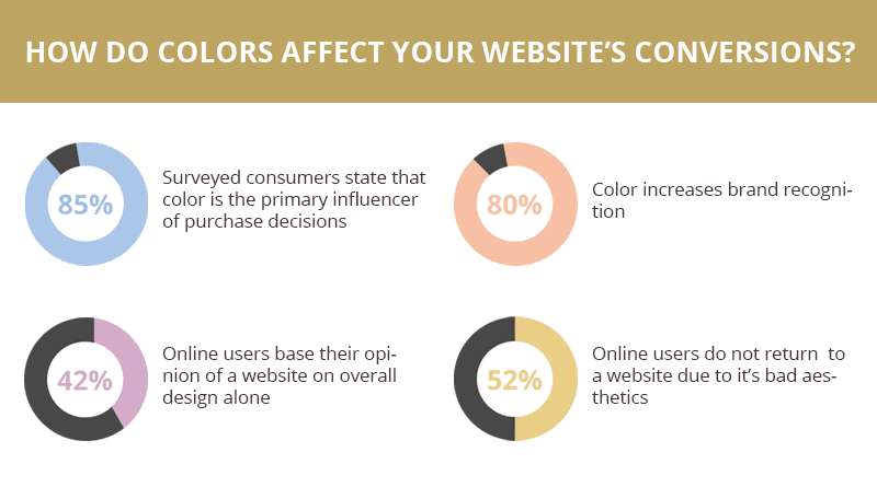
It’s true that you cannot ignore the power of colors. Colors can create a huge impact on your visitors. It’s important to carefully select colors for your logo, website, ad banners, social media posts etc. As it will create an impact on your audience, make sure it’s truly effective.
The role of color on website design
Once you have decided to launch your website, you certainly will have an interaction with your audience and expect them to take a specific action on your website. That could either be making a purchase, reading an article or blog, contacting you, filling a form or subscribing to your emails.
A single color website can look awful; therefore, you need to use more than one color on your website. Not only this, but you also need to think upon the best color combinations that will look both attractive and pleasing and represent your brand well. Ensure that the color scheme you choose is in the right direction and influences the desired actions for your website.
Related: Top 8 Graphic Design Trends for 2019 That You Can’t Ignore
Let’s understand the color wheel
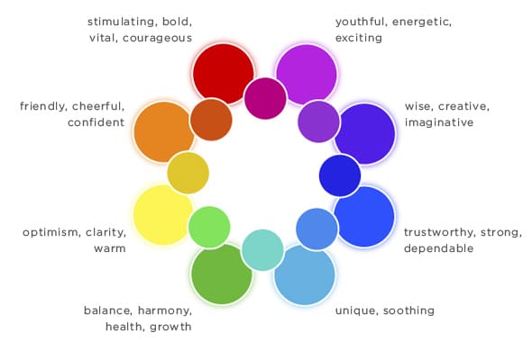
A study shows that color triggers different areas of the brain and creates a long-lasting impact. By considering this, you can encourage your visitors and increase conversion rate by catching their attention and connecting with their emotions. See which color means which emotion:
Color schemes
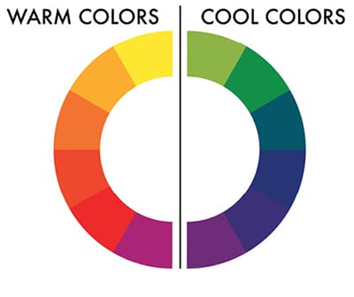
We all have come across the color wheel at some point in our life. It is an abstract illustrative arrangement of color hues around a circle. The color wheel shows the relationship between colors. This wheel is generally used by web and graphic designers to blend the colors that go with each other.
This color wheel can be bifurcated into:
Warm Colors
The colors represent passion, happiness, energy.
Cool Colors
These colors are used in the design to show trust, calmness, and professionalism.
You should choose the combinations of these warm colors and cool colors wisely. If you don’t use them correctly, you might end up confusing your visitors and the web design may not look appropriate and represent confusing emotions.
Related: 5 Reasons Why Your Website Is Underperforming And How To Fix Them
Color Scheme for your Website
Ever noticed how the colors on the website are always associated with its industry. Obviously, that isn’t a coincidence. The web designers purposely choose those colors that represent their brand, product or service well.
The first and foremost step in a web project is choosing a color scheme. You can start with your favorite colors and design your website, but the question is- will this really represent your brand? And do the selected colors go well together? Remember! A bad color combination and a bad design can affect your business.
First, identify what emotions you want your audience to associate with your brand. With the help of the color wheel choose the colors that represent your brand the most and later choose the colors that intact the color scheme. The below guide will help you choose the right colors that go well with each other.
Complementary Color Schemes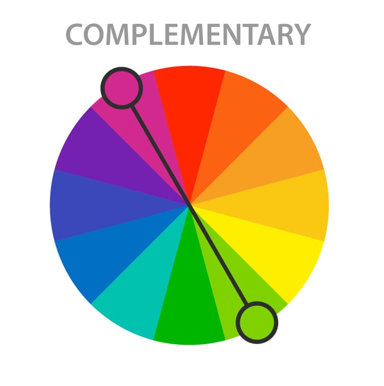
Complementary colors are on the other side on the color wheel and don’t consist of the same primary color. To create a powerful contrast, use two opposite colors. To put the limelight on the content, web designers use this scheme to choose the background of the website.
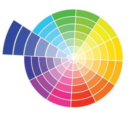 Monochromatic Color Schemes
Using three different values of a single color is called monochromatic schemes. Using this color combination gives a polished cohesive look and also, this combination is easy to work with as the colors will always suit each other.
Analogous Color Schemes
Picking adjacent colors on the color wheel create an Analogous color scheme. This scheme is generally found in nature and is appealing to the eye, reason that they match well and thus, create pleasing designs.
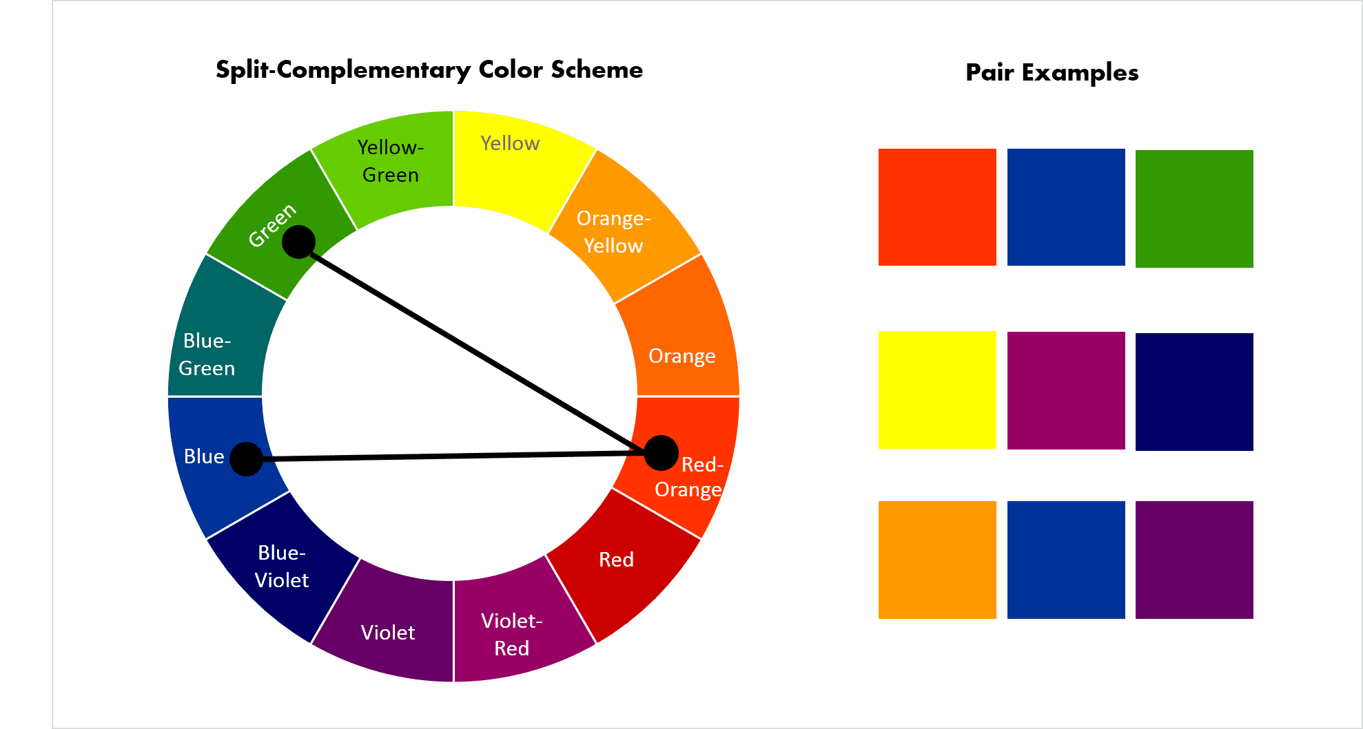 Split Complement Color Schemes
A split complementary scheme is a version of the complementary color scheme. It uses one color and the two adjacent tertiary colors of it’s complement. It creates a high degree of contrast but not as much as a complementary scheme.
Triadic Color Schemes
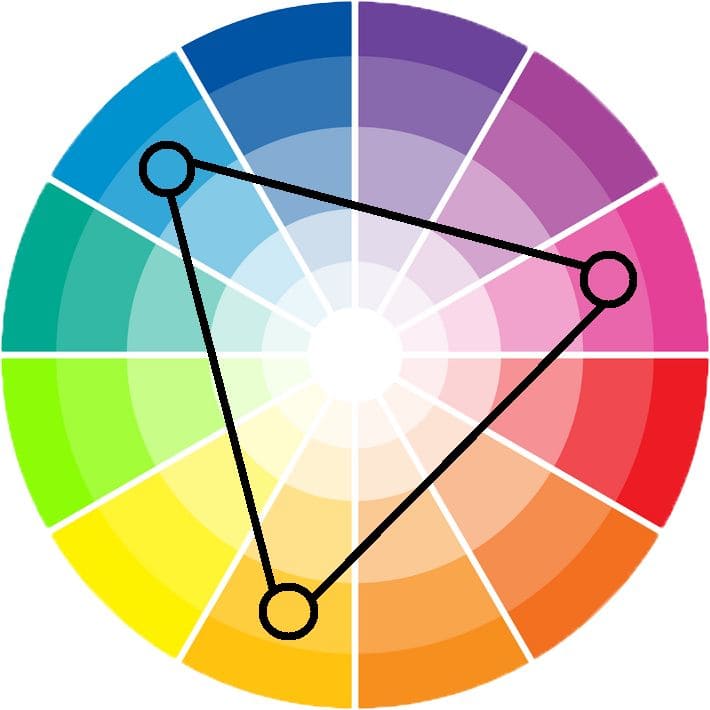 Choosing three evenly spaced colors on the color wheel is triadic color scheme. It is one of the best color schemes because you can use one color for the background while the other two can be utilized for content and other areas that you want to focus.
 Tetradic Color Schemes
Two complimentary pairs make a tetradic color scheme. When you pick one color to be dominant this color scheme will work best. It’s also important that you pay attention to your warm and cool colors.
Places where you should use colors
Here are some important areas of your website where you should be using colors:
• Buttons
• Headlines
• Pop-ups
• Banners and Graphics
• Borders
• Background
Picking the Right Colors
A lot of thinking, creativity and experimentation is required for choosing the right colors for your website. Remember, every color is psychological and every color creates different effects. Let’s consider an example of analogous colors, they are similar in hue and form a smooth transition from one color to another. Monochromatic color schemes are faint and sophisticated while complementary colors reside on the opposite side of the base color on the color wheel, thus, creating an extreme contrast.
Once you decide on the color scheme for your website, you are free to modify the value of each color by adjusting how dark or light you want. You can also adjust the saturation and intensity of the colors.
On the color wheel, each hue has an inherent value. For example, green is lighter than red. You may need to adjust the value of a specific color in order to match the contrast in your color scheme. In this case, making green darker might help.
Related: Web Design Tips for Startups
Conclusion:
Selecting the colors for your web design should never depend on your favorite colors or on a gut feeling.
Your website’s color scheme should not only reflect your brand but also catch the attention of your audience and make it look appealing. Good web design is the one that puts their audience first. Think about what they would want to see and then pick the colors. To stand out from others, choose a color combination that is unique and attractive.