Did you know that a user who visits your website homepage will take an average of 3 seconds at the most in deciding whether to stay or go to another to find what he is looking for?
Yes, you guessed it! Usually, that other website will be the website of your direct competition.
Being able to convince your potential client to stay with you in such a short space of time is no easy task, I acknowledge.
But it is possible.
Having a properly designed homepage to keep the public interested in your services or products is a key step in achieving this.
From this, I want to talk to you today about the keys to having an effective start page that makes your target audience get stuck on your website and help you retain those potential clients interested in what you offer.
Better yet … to do in it the action you want to achieve the goals that you have proposed with your online presence.
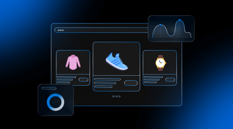
1. Your website homepage should make your offerings clear
Always keep in mind a fundamental concept when it comes to selling product or services over the internet.
All of us who surf the internet are looking for a solution to a specific problem.
And each of us can solve some of these problems for others.
That is precisely the online sale through a website or a blog: in making it clear how you can wire someone who has a problem (or several) that you can solve.

On your website homepage you must show how you can help your potential clients, so that, in those few seconds of decision that I told you at the beginning, they decide that it is you who can offer the best solution to their problem.
For example (and without going any further), on my home page I made it clear in the first message that I help people who want to increase their customers and sales through the internet through a website in WordPress or other CMS.
Come on… it is highly impossible to offer a concrete solution in fewer words, right?
Everyone who enters the website/blog is trying to find out how you can solve the problem or problems in just a couple of seconds.
This is what you should do on the web of your business sooner rather than later.
Also Read, How to make Google love your website – Simple SEO Rules
2. The most important is the content
This phrase, which you have heard me say (or read) on more than one occasion, is also applicable to the home page of your website and is closely related to the previous point.
Making a clear and concise design is important, but it is not the most important thing.
Having the best design in the world is of no use if your content says absolutely nothing or does not hook with the emotions of your prospects.
Apart from how you have arranged the design of your home page, what will really make your visitor stay or leave is to capture their attention by what you say in your texts.
Keep an eye on your website homepage. Shortly after starting to read your first title they will notice how with your words you are captivating so they want to read the following text. And the next, and the next to the next…
3. Call-to-action “Above the Fold”
So it is important to make clear on what you can help your visitors and what main action you want your visitors to do on your website.
We all like to make things easy for you… why would the people who visit your website be different?
In order not to saturate the user with a thousand and one actions they can do, it is best to establish a call to the main action.
A call to action is a message, button or link that seeks to attract potential customers and turn them into end customers.
Depending on your case, you could establish a call to action on the website homepage for different purposes such as:
- Get subscribers through a subscription form, offering a gift that motivates your potential client to leave their name and email.
- Promote a specific offer for a limited time of a service or product to buy it.
- Direct a button to your contact page or request a quote.
- Establish a link or button to make a reservation (to stay in a hotel, have dinner in a restaurant or make an appointment in a clinic).
- Publish a customer service telephone number so that they can call you directly through this communication channel.
Important is that this call to action should be “above the fold”.
What does this mean?
Basically, it means that the call to action is visible at first glance of sight just after entering the homepage of your website, without the user having to scroll with the mouse wheel.
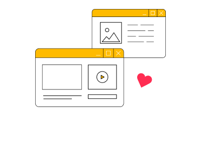
Call to action “Above the fold”
In this way, you will not have to walk looking for anything or breaking your helmets to do the action that you want them to do, in order to achieve what you have marked as the main objective in a simple and effective way.
4. Do not put too much information
You should not put too much information on your homepage.
In order to expand or detail more specific information relevant to a specific service or product are precisely the pages of that service or product.
Do not fall into the mistake of saturating your prospect. It draws their attention and causes curiosity about the information and continues reading about what you sell or how you can help him.
In this way, you will not only be getting your potential client to report more in depth only what interests you (avoiding unnecessary information for him) but also you will be improving the rebound percentage of your website and, consequently, your SEO.
5. Don’t overload design
Just as you do not have to “burn” the reader with too much content, do not do it with the design as well.
Too many colors, fonts, banners, advertisements or other elements can make your visitors run away.
My advice is that the design of a home page should be simple and focused on getting results. Without many frills or distractions that do not contribute anything (or, worse, that remain).
For example, image sliders.
Do you really think that someone is going to stop to look at the 5 or 6 sliders that you have placed on your home page?
That yes, that “it is very nice” to move those images … but … are they really contributing something to your client?
Remember … in just 3 seconds they will decide whether to stay or leave.
During those 3 seconds, they will “scan” your homepage to see if you can help. They will not stop to read anything carefully unless you capture their attention.
Of course, they will not be watching your 5 or 6 slider images. At most, they will see the first one.
Not to mention that slider will make your homepage slower, hurting both the user experience and the loading time of your website and, consequently, the SEO of your website.
After reading this, are you thinking that it would be better to simply put a static image next to your main message directly before the slider?
Well, I wanted to get there: better simplify the design of your home page.
6. Do not even need to be too original
Have you ever thought why the most successful professionals or companies on the internet have several similar elements in common on their home pages?
No, it’s not because they copied one another.
It’s because that kind of home page is the most effective and it works just fine.
It is fine that you want to differentiate yourself from the competition, but not that you want to reinvent what is already invented.
There are certain elements or guidelines (like everything I’ve explained in the previous points or what I have yet to explain in the following) that if they are established in so many websites is for something.
That does not mean that it can be a bit original in the designs of the homepage.
But without passing, since then surely you will end up failing the next point that I am going to tell you, which is directly related to this.
7. Think of your targeted audience, not you
Have you heard that “for taste, add colors”?
Well, that …
Whatever you like is not necessarily what your visitors or potential customers will like.
Or worse: What is going to be more comfortable and practical.
Keep in mind that people have taken some habits of browsing the internet and that, if you start, for example, to change elements of the site without a ton or are (as can be the location of the menus or the logo), you will be complicating life of those people that visit your website.
And be clear at this: If you make it difficult for your visitors to understand the page, they are going to leave your website and jump to another one.
They have many more sites on the internet offering the same as you (or something similar) in which they make it easier to understand. Why are they going to stay with you?
So, that you like the menu to appear on the right side of the screen on one page of your website and appear on the top of another (another example of being “too original” as in the previous point), it means that it is the best thing for those who are visiting you.
That is, you are thinking of yourself, what you like, how original you want your website to be, but you are not thinking about what is really important: the target audience and its ease of use.
8. Do not be afraid to show yourself publicly
One of the biggest repairs that many online business owners need to think over. If you ask me, I will suggest you put a picture of you on the homepage of your website.

If someone who is hiding behind a pseudonym/mark or someone who shows that he does not have to hide and shows himself publicly without hesitation, who will gain more trust?
In short: Posting a photo of yourself or your work team on your homepage builds trust.
Look at it in a different way, you’re tired of posting your (non-professional) photos on social networks, where many people can see you.
Is it so uncomfortable for you to post a well-made photo by a professional photographer on your own website?
That fear does not make any sense. Show yourself and you’ll see more customers from different parts of the country (or the world) come to you through your website.
As I always say, people prefer to buy from people rather than brands. Showing an image of you can help you to humanize your home page, your website, and your business.
9. Show your latest blog posts but do not just show your blog
If you have arrived here, you will have come to the conclusion that I am in favor of using a static page as a homepage.
There are many people who sell services or products through the internet. Many of them do it through a blog.
And they do very well, by the way.
The mistake many of them make is that on their home page they only display the latest posts on their blog (or, directly, their entire blog).
In doing so, you have no control over how to enhance the true value of your services, products or yourself as a professional in that first glance of such an important view.
And, therefore, you do not have the control of retaining in your web more time to possible clients.
Not only that, you also do not have control of the SEO of your home page, since each blog entry that appears here will have very different keywords from each other. Trying to position only one that interests you in this way is impossible.
That is, using only the entries of your blog as homepage does not really serve you.
By this, I do not mean that you make them disappear radically.
Publishing your latest articles on your home page will surely generate interest in people who visit your website both in your products and services and in you as a professional or company, so it is a good weapon to use.
What I’m telling you is not to use that weapon alone.
My recommendation is to combine the last entries of the blog with the elements and techniques explained in the previous points.
I can assure you that the results you will get for your business will be much better.
To end…
After reading this post of more than 2,000 words (I congratulate you for getting here. Today I have “rolled” over the account). I hope it has become clear to you why the home page of your site is so important and how you can improve it to get better professional results with it.
Now it’s up to you to tell me. I’ve talked enough already today.
How is the homepage of your website?
Dare to leave your comment a little lower and we continue talking.