 Grace Cornish
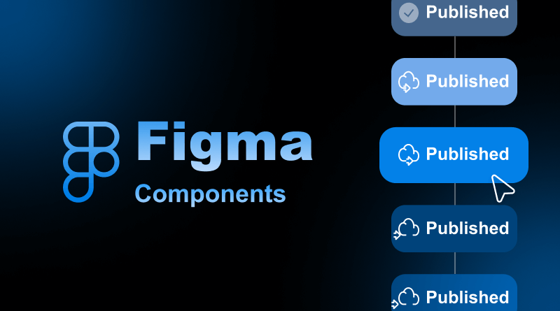
Forget “copy-paste.” Designers know how to invest their time precisely.
The speediest design teams make use of their UI elements as though they are coding, and it all starts with a basic Figma component. Figma components signify a step forward in modern UI/UX design trends. They enable designers to build additional scalable and consistently efficient systems.
Knowing how to build and manage reusable components in Figma improves your system design. Whether you’re creating your first design attempt to establish a design system or enhancing your workflow efficiency, this skill is essential.
In this detailed guide, we’ll learn all about Figma components, starting with the basic concepts and processes of creating and mastering component properties, variants, and team libraries.
At the end of this read, beginners will be able to create, manage, and share Figma components to enhance the system’s design. Every design will become consistent, modular, and easy to revise. So let’s begin.
Table Of Content
What is a Figma Component?
To understand a component in Figma, begin with learning about what is Figma. A component is a reusable design object in Figma. It serves the purpose of a master template. It is the “blueprint” for the buttons, icons, cards, and navigation bars that occur multiple times in your design. Rather than recreate a design element within the same project, the component feature allows you to design something once and use it throughout the project.
The purpose of a component is to ensure consistency and conserve time. When you modify the main, or master, component, all of its duplicates, or instances, will be modified as well. This functionality simplifies the design process by eliminating the necessity to roll back adjustments manually rather than keeping the design system consistent.
Benefits of Figma Components
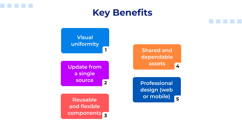
- Visual consistency within your designs.
- A single point to make updates across multiple screens at once.
- The design components are reusable and flexible, making collaboration even stronger.
In order to create a smooth and professional workflow in Figma, there is a need to know component design whether you are designing a mobile application or website.
Similar Read: Figma Alternatives: Finding the Design Tool That Fits Real Workflows
Here’s how Figma component properties make it possible to work more conveniently:
- Text Property: Alters the text inside the component to strings defined at the instance rather than the master component (such as “Buy Now” and “Add to Cart” buttons).
- Boolean Property: Makes on/off states to display and conceal items such as labels and icons in a component.
- Instance Swap Property: Swaps icons or images that are members of a set instantly without rebuilding it.
- Variant Property: Manages various states of a component (active/inactive buttons, etc.) for easy design.
Figma’s component features offer powerful flexibility. In simple words, users can create one primary design and adapt it for many different scenarios while retaining the same design. This dynamic adaptability promotes design consistency.
What is a Figma Instance?
An instance in Figma is a copy of a main component that retains all its properties and styles. Think of it as a clone that stays linked with the original—all the original component updates will reflect automatically to its instances.
Suppose you make a component “Primary Button.” Every time you edit the color or font style of the button, all the instances of the button across the entire project will change. This helps make the design system cohesive and makes global changes faster.
The flexibility each instance allows is, truly, the most powerful attribute of instances. Each instance is linked to the main component’s design and structure, but you will be able to make some changes to the properties of the instance. Change the text, visibility, or even detach it, and more! You can swap and modify icons, and a lot more!
Why do Instances Matter?
- Automate design consistency across multiple screens and pages.
- Focused customization is possible without the need to design from scratch.
- Avoid design drift by keeping your UI to the same standards everywhere.
What is a Figma Variant?
In Figma, a variant is a way to consolidate, group, and organize different component versions. A variant is a way to manage states of an element, such as default, hover, active, and disabled. All of these can be placed under a single variant.
Another example would be components like Button / Primary, Button / Hover, and Button / Disabled. All of these can be combined into a single master button component with variants. This simplifies the design and makes the different states easier and more intuitive to toggle.
Example:
Let’s say you are designing a button. You can create different variants based on the:
- State: Default / Hover / Pressed / Disabled
- Type: Primary / Secondary / Outline
- Size: Small / Medium / Large
All of these different attributes can be combined in a single component set, and Figma creates the ability for users to switch between these easily with the Variant properties panel.
Why Variants are Useful
- Maintain the arrangement of different components and keep their layout in one place.
- Support design handoff by consolidating all states and options for developers.
- Speed up prototyping by allowing a single action to switch between different states of a component.
- Reduce clutter in your Assets panel by merging items of the same type.
Figma Main Component vs. Instance vs. Variants
| Feature | Main Component | Instance | Variant |
| Definition | The original master design element that acts as the single source of truth. | A copy of the main component that stays linked to it and inherits its properties. | A grouped collection of related components that represent different states or versions. |
| Purpose | To maintain a consistent and editable design structure. | To reuse the component in multiple places without recreating it. | To organize multiple component states (e.g., active, hover, disabled) in one set. |
| Editability | Fully editable — changes here affect all linked instances. | Partially editable — changes are limited to defined component properties. | Each variant is editable, but managed within one component set. |
| Use Case | Creating the master version of a UI element like a button or card. | Reusing the component across frames, pages, or files while keeping design uniform. | Managing different styles, states, or sizes of a component together. |
| Effect on Design System | Defines the core design structure and ensures global consistency. | Enables scalability and reusability across projects. | Improves organization and helps manage complex UI systems efficiently. |
| Example | “Button / Primary” (master design). | Copies of “Button / Primary” used across screens. | “Button / Primary” with variants like “Hover”, “Pressed”, “Disabled”. |
Figma Components for Beginners: How to Create a Component?
Are you looking for how to create components in Figma? Well, it’s simple and you just have to follow these steps below.
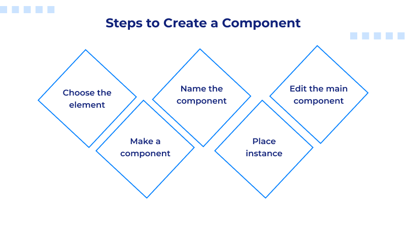
- Selecting the Element: Choose the shape, text, or a group of layers you want to use as a component.
- Creating a Component: You can right-click on the element and select ‘Create Component,’ or you can use the quick command of Ctrl + Alt + K (Windows) or Cmd + Option + K (Mac).
- Naming: While a component in Figma can be named anything, using a descriptive name makes the organizer easier (e.g., Button / Primary).
- Using the Instance: You can use the component you created under the Assets panel.
- Editing: You can edit the master instance component, and it will reflect in all of its instances.
Congratulations, you now have a component in Figma to help your work to be consistent and in scale.
Figma Component Properties: How To Detach a Component
Sometimes you need to detach an instance from its original component. Do this with caution. Once you detach, it stays a unique instance all on its own and will no longer receive updates from the master component.
When to detach:
- You can detach components if you need a one-time edit, and that custom edit doesn’t align with the component structure.
- You can also do this if you want to test a different layout or prototype that you do not plan to sync globally.
- Be careful not to unplug too frequently, as this will result in more work and discrepancies.
- For streamlined and scalable workflows, leave your Figma components as linked as possible.
Team Libraries (Sharing Components Across Files/Teams)
Figma Team Libraries streamline collaboration by allowing designers to share components across different files and projects. This sharing saves designers time and effort. Designers can access shared components once a component is published to a library, which ensures that all users of the component adhere to the set design standards.Helpful Read: ChatGPT Prompts For UX Designers
How it helps:
- Design consistency is maintained throughout your entire team.
- It saves time on new project setup since you can reuse old UI components.
- Updates can be made in the main library, and all components will automatically sync.
For growing teams, it is vital to share a Figma components library. It offers a flexible design system, simplifying maintenance and scalability.
Final Consideration
Once you master Figma components and understand how to build, arrange, and reuse components, instances, and variants, an effective design workflow will follow.
Design tasks become quicker and easier to complete with reusable components. Just as dependable hosting services deliver seamless digital experiences, design-consistent web projects built using platforms like MilesWeb provide that consistency and dependability. A well-hosted web project combined with an intelligent design system sets the foundation for high-quality digital solutions.
FAQs
1. How do I effectively use the Assets panel to organize and find my reusable components?
Group similar components using the slash (/) naming convention, Button/Primary and Card/Image, for example. They will automatically be categorized into the Assets panel. You can also use specific libraries and set other ones to disabled to reduce clutter. Search filters help you to quickly find any reusable Figma components you need.
2. What are the key best practices for Figma components for beginners to ensure a scalable workflow?
Put your components into place, set consistent naming conventions in advance, and organize everything in a Team Library for simple sharing. Employ component properties that enable flexibility, don’t detach unnecessarily, and audit your library frequently. A standard and organized setup will facilitate incremental growth for your design system.
3. How do I manage text, icons, and visibility with Figma component properties in one component?
Text properties allow you to edit the text of buttons and labels in instances. You can swap icons quickly. Boolean (Toggle) properties can hide or show icons, labels, or any other elements. These properties allow your components to stay linked to a master component to easily update and synchronize adaptive changes.
4. How can I use Figma variants and properties to have the most flexible component library?
Employ Variants to control toggle states (active, hover, or disabled) and employ properties to modify text, icons, and visibility. This synergy maximizes the component library for scale, editability, and maintainability without having to replicate elements.