 Oli Graham
Over the last few years, internet usage on a computer and on a mobile device has balanced out at around 50/50. Consequentially many businesses may benefit from focusing on building an online presence that prioritizes the experience of phone users ahead of those on a desktop.
Although numerous individuals have chosen to create “mobile-first” websites, many still wonder how to make their websites mobile-friendly using simple and effective techniques.
Therefore, if you’re looking to build a mobile-friendly website while keeping performance in mind, this blog has a solution.
This article also offers some important pointers that help you to understand why having a mobile friendly website is beneficial.
The State of Mobile Internet Use
Before we look at how to optimize your online presence for mobile users, it’s worth comparing the ways that people behave online vary between desktop and mobile.
Although there is little difference between the overall amount of online activity between desktop and mobile, there is a lot of variance between the types of sites that people visit when using the different devices, as well as differences in buying behavior.
The majority of mobile web use is social and informational in intent. The vast majority of social media use occurs on mobile devices, and similarly, people prefer to use mobile devices during the research phase of the buyer cycle.
The majority of purchases online are still made on desktops. This is demonstrated through the fact that the price per click on a mobile device is 24% lower than for an equivalent click on desktops.
Determining Whether you Should go “Mobile-first”
Although more online purchases are made on desktop rather than on mobile, this does not necessarily mean that your business may not benefit from creating a mobile-first web presence.
Local brick-and-mortar businesses, for instance, are far more regularly found through mobile search, which makes it vital to understand the steps needed to make your website responsive across devices. Often these businesses do not sell online, but rather an “online conversion” occurs when people find their contact details and make a call or visit their premises.
If we use very general statistics, you could say that as a rule of thumb, it’s crucial to consider how a website can be made mobile-friendly when identifying your core traffic source.
However, the best way to determine whether to go mobile-first is to set up your analytics to track conversions and then base your decision on which device leads to the highest volume of conversions.
For businesses where conversions do not happen online, local brick and mortar businesses, for example, you might have to think outside the box about what constitutes a conversion. For example, if you are a brick and mortar business that takes bookings over the phone, or you do not take bookings at all, then you may want to have goal conversions set as having someone clicking on your contact page, set up call tracking, or have someone spending more than 90 seconds on your website as count as a conversion.
The takeaway here is that the most important metric when choosing whether to optimize for mobile or for desktop the raw number of conversions by each device.
The Importance of Map Visibility in Mobile Search
If you have a website for your business, and you want to develop a mobile-first web presence, one of the most important things to focus on is your Google My Business profile.
Mobile searches far exceed desktop based searches for location based searches such as “[business type] in [location]” and “[business type] near me”.
When someone makes a location based search for a business on a phone, the first result that Google delivers them is an interactive Google Map embedded with relevant local businesses.
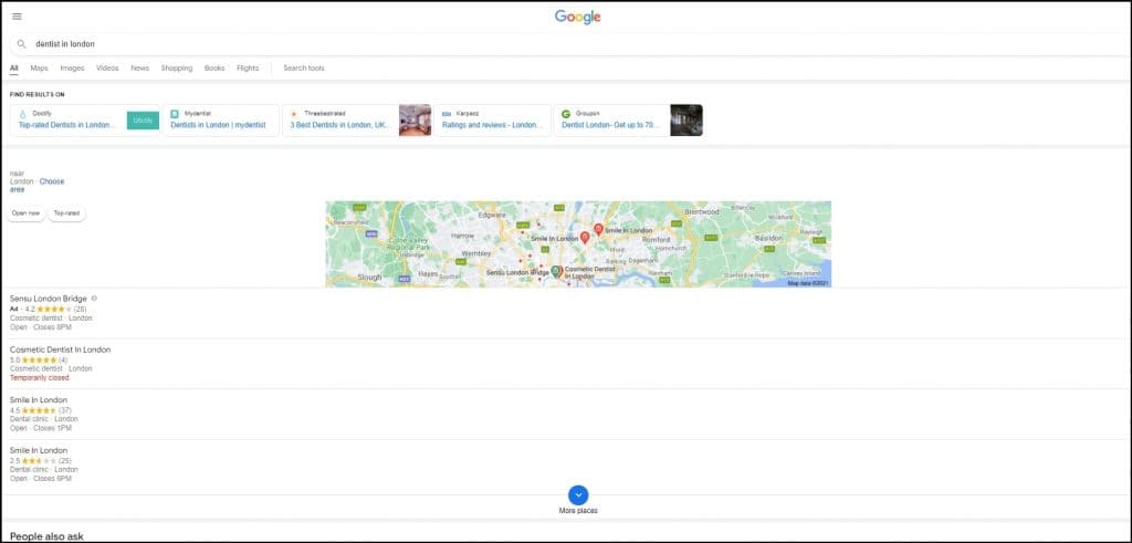
As seen in the image above, straight below the map are a list of local relevant businesses along with their average Google review rating and opening hours. These listings are clickable and allow someone to view a business’s phone number, physical location, and access their website with one click.
For location based searches made on mobile devices, the businesses listed below the map get the lions’ share of users’ clicks. This is because the map and the listings below it take up the whole screen for two-three scrolls’ depth on such devices.
The organic listings are therefore rarely even seen by mobile searchers.
The implication of this for business owners wanting to create a “mobile-first” online presence is that understanding the process of making your website responsive automatically is just as important as traditional SEO tactics—especially since optimizing for Google Maps should even take precedence over traditional organic listings.
Optimizing your web-presence for map visibility is far more straightforward than traditional SEO.
The most important parts of optimizing for Google’s local map are:
- Making sure that your Google My Business profile is filled out as far as possible, including having several images of your business and regular posts.
- Getting listed in relevant local directories and ensuring that your business’s name, address and phone number are consistent across these platforms.
- Making sure that the contact information on your Google My Business profile is consistent with the information on your website’s contact page.
- Getting as many positive Google reviews as possible.
It’s worth reiterating the supreme importance of having a good number of positive Google reviews in doing well in mobile-first local searches. Prominence on the Google Map is heavily affected by click-through rate, meaning the more clicks that your business has on the map listing the higher it will be displayed on that listing in the future.
As your average review rating, and overall number of reviews, is immediately visible on the map listing. Given that people base their purchasing decisions on the “social proof” that these reviews provide, the higher your average rating the more clicks your business’s listing will get.
This has the double effect of increasing conversions from current impressions and allowing you to have more impressions in the future, as you are pushed further up the map listings.
Efforts to optimize your Google My Business profile, and to gain as many positive reviews as possible, should trump efforts to optimize one’s website if you are trying to go “mobile-first”.
How to Make a Mobile Website?
While the norm nowadays is to make sure that your website is “mobile responsive”, meaning that its design elements and formatting can change depending on the size of screen that it is displayed from, to create a mobile-first web presence you need a mobile-first website.
Most responsive websites are primarily designed with desktop users in mind, which leaves many wondering about the best ways to make their website mobile-friendly without compromising desktop functionality.
Mobile first websites are designed around look and usability on a mobile device. While desktop experience is still important, if design sacrifices need to be made, the mobile version of the website takes precedence.
A mobile-first website starts with higher level formatting and design elements, but extends to navigation and content layout.
As far as design is concerned, mobile first websites should be laid out in a way that only one element is visible at any one time. For example, if a user is reading the content on a website, they should not also be able to see a menu or sidebar options. With such little space available there should never be more than one attention point. The different elements on a website should therefore be collapsible in order to allow this.
Mobile-first web design also needs to appreciate the fact that mobile orientations are portrait, which often leads to questions regarding how to create a mobile-friendly website using modern layouts and techniques. This is particularly important when it comes to designing elements such as forms where several columns are often used on a desktop.
If you are building your website on WordPress, and you want to go mobile-first, then it’s well worth going with a mobile-first theme. Some of the most popular mobile first themes include:
- Sydney
- Responsive Mobile
- Graphy
- Ultra
The “mobile-first” approach can be extended to the content on a website itself.
Given the limited space and portrait orientation on a phone, you are unlikely to be able to display more than 80 words on a phone screen at any one time. A screen that is nothing but a wall of text is difficult to read, so “mobile-first” content needs to be written in short, snappy paragraphs. Ideally you should not have more than two sentences in a paragraph.
“Mobile-first” content should also be kept as short as possible in general. This is partially because reading on a phone takes longer than on desktop, but also because long pages can load very slowly on a phone, particularly when someone is on a poorer connection. When optimizing a mobile-first website for search, one consideration you should have is targeting keywords for which you can realistically rank with shorter-form content.
Longer form content will drastically reduce conversions on mobile, so creating long-form content for ranking’s sake will be of little use if the majority of your traffic and conversions comes from users on mobile devices.
The Importance of Schema for a Mobile-first Web Presence
Given that there is far less SERP space up for grabs on a mobile than on desktop, the role that schema has to play in increasing click-through-rate is amplified if the majority of your converting traffic uses a mobile device.
For those who do not know, schema is an additional layer of code that you add to your website that allows for certain features of your page to be displayed on the SERP for specific queries.
You can see an example of schema in action if you Google a recipe. When you do this you are presented with search results that contain an image of the final prepared meal and a star rating of the recipe.

Schema allows your page’s featured image to appear in the SERP
As we can see in the above image, schema allows you to expand your SERP listing to take up half the screen space on a mobile device (for relevant searches at least).
If you have a WordPress site, you can add schema using the plugin Schema Pro. There are lots of different schema types available, and the schema that you should add depends on your business type and the information on your page.
Some of the most common types of schema include:
- Local business markup – This allows you to add extra data to your Google My Business profile
- Product markup – This allows you to display product cost and reviews in the SERP
- Event markup – This allows dates of specific events to show up in the SERP
- News and article markup – This allows you to rank in Google news and in the “top stories” section of the SERP.
Example of the news schema markup in action
Given the plethora of schema options for editorial and small business sites, sites that are specifically searched for more often on mobile, correctly used schema is an essential part of creating a mobile-first presence.
Reducing Friction on the Phone
A final part of having a “mobile-first” web presence is making it as easy as possible for your visitors to convert over the phone.
The key to maximizing conversions among mobile users is by making it possible for users to convert without leaving the current window in their phone. The need to change app or window creates friction between a user and their conversion goal that simply is not there on desktop.
For purely online purchases, this should not be difficult. All you need to do is incorporate a buying or booking platform into your website that is laid out in the mobile-friendly way that we have described earlier.
For websites whose conversion goals are calls or foot traffic, it’s crucial to explore ways to make a site mobile responsive so that users don’t drop off before taking action. Allowing users to make a call with one click from your website, or setting up directions in Google Maps with one click can in essence allow them to convert without leaving their current window.
Wrapping Up
People who have websites where most conversions come from mobile users should strongly consider building a mobile-first web presence.
Building a mobile-first web presence takes into account every part of your customer’s online buying journey, from finding your website, to navigating through your website and making a purchase. The way that each of these are performed differs between devices, and can therefore be optimized for mobile users.
FAQs
What is a responsive web design, and how does it contribute to mobile-friendliness?
Responsive web design causes your website to automatically rescale to various screen sizes such as phones, tablets, and desktops. It helps users not have to zoom or awkwardly scroll to view content. For website owners, it is crucial to understand how to make your website responsive to deliver a seamless mobile-friendly experience that retains the clients.
How can I check if my existing website is mobile-friendly?
To see how elegantly your website performs on a phone, just open it and check if it looks good and is easy to navigate. You can also take advantage of Google’s Mobile-Friendly test tool to get instant valuable feedback. It is a good practice to perform these checks periodically to ensure that your website works well on devices.
Should I use a separate mobile website or responsive design for mobile-friendliness?
Responsive design is always better as it functions on all devices with a single website, and it is easier to manage. Google also prefers responsive websites for mobile search ranking. Independent mobile websites are harder to manage and tend to be troublesome—particularly when you’re understanding how to make your website mobile-friendly.
How often should I test my website’s mobile responsiveness?
Test your website after regular intervals to detect issues before they cause any harm to your functionality. Prepare a schedule of testing to ensure users always enjoy a smooth experience. It is a simple way of being proactive against mobile responsiveness issues.