 Steve Francis
The use of mobile devices and tablets is growing rapidly. More and more users are opting for a tablet or a so called Phablet- which is big screen phone instead of their laptops and desktops. With the host of applications and services one can easily do all the tasks using their phone there is shift towards handheld devices for all activities which includes web browsing as well.
Purchases using mobile phones are now higher than desktop purchases. A recent study shows that almost 60% people of U.S have a Smartphone and there will be 5 billion mobile phone users in the next three years. Given that fact that so many people will own a Smartphone and are likely to visit your website using their device. Therefore you need to ensure that your website is capable of meeting the needs of the visitor.
Earlier website owners used to have a mobile friendly version of their website which had minimal features and was of no good. Now, there are numerous devices and they server websites the same way you see on a desktop and to be able to fit your website in the small screens you website needs to be responsive.
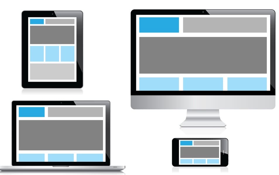
Responsive Website is a website which can mould itself according the device it is being browsed on and provides the same level of user experience as one would typically get on while browsing the website from a desktop.
Why do you need a responsive website?
• To provide the best user experience
• To encourage the user to purchase via their mobile device itself
• To boost sales via mCommerce
Benefits of having a responsive website:
Better Conversion Rates
A user typically searches for a company or brand using their Smartphone and simply providing information about your business would be futile. With a responsive design you can increase your conversion rates and encourage the user to purchase from our website via their Smartphone itself.
SEO Benefits for your Website
Usually if you are running a promotional campaign or someone recommends your company then that person would naturally look up your business online and if they do not have a good experience with your website then they will ignore you.
To understand this better imagine If someone searches for your business on Google and your website is not optimized for mobile devices and is not responsive then the user would go away which would increase your bounce rate and ultimately hamper your mobile search rankings. So if you are looking for better rankings on mobile search then you better optimize your website.
Easy management
If you are thinking of having a mobile version or you already have one than you must be well aware of the hassles involved in dealing with two versions of your website and optimizing both sites separately. If you are running an SEO campaign then you would have to do separate optimization for both these sites so that your website ranks well in mobile and desktop searches. This is not only very cumbersome but also quite costly compared to having a single version of your website.
On the contrary, if you have a responsive website then you all you have to do is optimize it according to your target market and you would get benefits in both mobile and desktop SERPs.
Conclusion
It is much easier and better to have one responsive website to cater to visitors on all kinds of devices. A responsive design is also preferred by major search engines and if you want to rank well and provide a great user experience which eventually increases your sales then you must consider having a responsive website.